The Loch Ness photos that shaped modern “Nessie” culture didn’t spread because they were crystal clear. They spread because they were just clear enough to let your brain finish the picture.
That’s the core problem. A dark shape on dark water, shot at long range, then copied in newspapers and books, can look persuasive while carrying very little solid information. When you add deliberate hoaxes and honest mistakes, a century of images starts to feel less like a record of an animal and more like a record of how easily cameras can mislead.
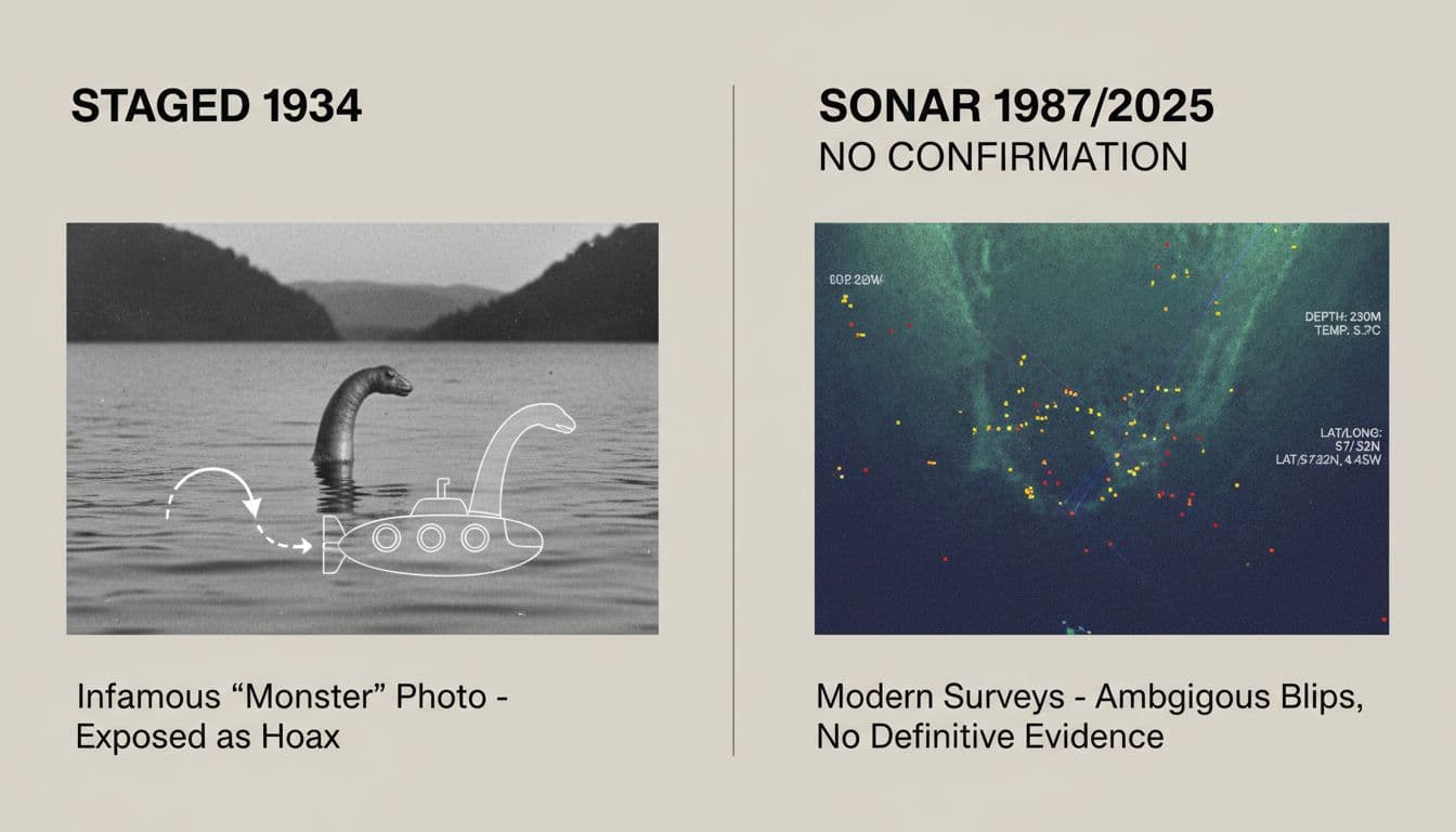
What makes this story worth revisiting in January 2026 is that we’ve got a second kind of evidence people cite now: sonar. It’s more technical, less romantic, and still not a clean answer.
Why Loch Ness photos are such slippery evidence
A photo feels like a receipt. But with Loch Ness, the “receipt” often lacks context: distance, lens type, water conditions, and what was happening just outside the frame.
Even honest images can fail for simple reasons:
- Scale collapses on open water. Without a clear shoreline or known object, a small wake nearby can look like a large body far away.
- Waves and boat wash mimic shapes. A line of wave peaks can read as a back and humps when the light is low.
- Cropping can hide the giveaway. Many famous images were published tightly framed, removing horizon, shore, and anything that would anchor the size.
- Old reproduction destroys detail. A 1930s print photographed again for a newspaper can lose clues that matter, like ripples around an object or sharp edges that suggest a solid model.
There’s also a human factor that matters more than people like to admit. Once you’ve seen a famous Nessie silhouette, you can’t unsee it. The brain is a pattern machine, and Loch Ness is a perfect stage: long, dark, and often choppy.
This doesn’t mean every witness is lying. It means a camera can faithfully record something real while still leaving its identity unresolved. That’s why debunking and belief can both grow from the same image.
For a grounded summary of how skeptics and scientists have approached the evidence over time, see Vox’s explainer on the Loch Ness Monster claims.
How the famous images were staged (and why they worked)
When people talk about staged Loch Ness images, they usually mean the 1934 “Surgeon’s Photograph.” It’s the classic: a long neck, a small head, a few ripples, and nothing else to compare it to. For decades, it was treated as the best visual evidence.
The problem is that the photo’s power comes from what it doesn’t show.
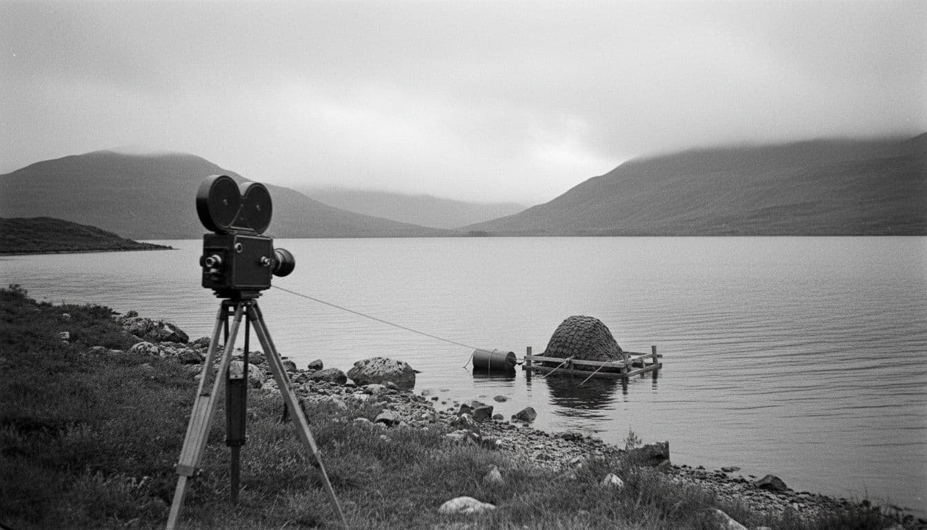
Accounts that surfaced later, including statements attributed to people connected to the image, describe it as a constructed model photographed on the loch, then presented as something larger. The commonly repeated description is a small “hump and head” mounted on a toy submarine or floating rig. Because the shot is tight and low, the water becomes a blank background. Your brain supplies the rest.
Two details matter here, even if you’ve heard the story before:
First, the staging didn’t need to be perfect. It only needed to survive a quick inspection in a newspaper era, when most people saw small, high-contrast print and had no access to negatives, outtakes, or metadata.
Second, the photo fit the public’s expectations. By the mid-1930s, reports had already primed readers to expect something like a plesiosaur neck and head. The image looked like what people had been told to imagine.
If you want the photo history laid out with attention to how the narrative developed (and how messy it got), Darren Naish’s review is a useful checkpoint: Scientific American’s look at Nessie photos revisited. For a photography-focused retelling of the “Surgeon’s Photo” backstory and its later unraveling, see the story of the Surgeon’s Photograph.
The bigger lesson isn’t “people were gullible.” It’s that a staged image can be technically simple and still become culturally permanent when the scene is hard to verify, and the audience wants the mystery to be true.
What the best sonar data shows (and what it doesn’t)
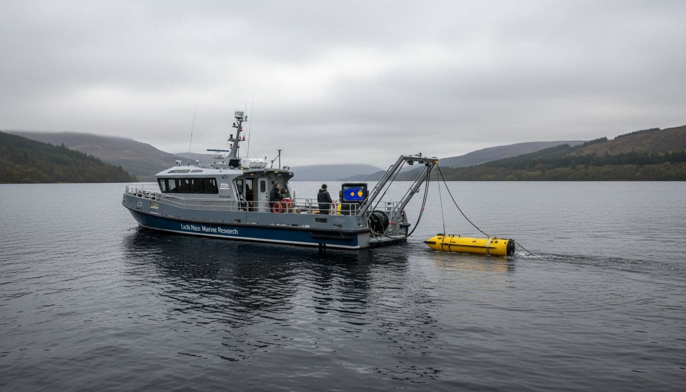
Sonar feels like the antidote to the photo problem. It measures sound returns in water, not light on waves. But sonar has its own traps, and the best Loch Ness data still lands in a careful middle ground.
What sonar can measure well
At its best, sonar can tell you there’s something reflective at a certain depth and distance. Depending on the system, it may suggest shape, size, and movement.
Here’s a plain-language snapshot of what different sonar approaches tend to offer:
| Approach | What it’s good at | What can go wrong |
|---|---|---|
| Single-beam (typical fishfinder) | Depth and strong targets under the boat | Narrow view, targets can be missed or mis-sized |
| Side-scan sonar | Wider “picture” of the bottom and mid-water returns | Interpretation is tricky, shadows and angles matter |
| Multibeam sonar | Detailed mapping, better coverage | Still doesn’t identify species, needs careful calibration |
| Repeated survey passes | Checking if targets repeat in the same place | Loops in boat traffic and water layers can repeat too |
What Loch Ness sonar has actually produced
Across decades of searches, sonar teams have reported unusual contacts. That part is real. But “unusual” is not the same as “unknown animal,” and it’s not the same as “large breeding population.”
The most responsible summary, based on public reporting up to early 2026, looks like this:
- There have been intermittent sonar returns that some observers think are larger than typical fish.
- Those returns have not matured into a consistent trackable target with clear biological features.
- Natural explanations often fit the data: fish groups, drifting debris, seals, boat echoes, and layered water effects.
One underappreciated factor is the loch itself. Loch Ness is deep, dark, and structured by changing water layers. Wind can set up long, slow internal waves (often discussed as internal seiches) that affect how sound travels. A sonar “blip” can be real in the sense that sound bounced off something, while still being misleading about what that something is.
Photo evidence vs sonar evidence
Photos and sonar fail in opposite ways. Photos can look vivid while saying very little. Sonar can collect lots of measurements while still leaving identity uncertain.
If you’re weighing a new “best ever” sonar screenshot, a few checks help:
- Was the contact repeated on multiple passes, or did it vanish on the next sweep?
- Is there a clear scale and range setting shown, or is it a cropped screen grab?
- Could it be another boat or the bottom contour, especially in busy areas?
- Is the raw data available, or only a single frame shared without context?
Sonar is valuable, but it’s not a magic truth machine. It’s one instrument in a hard environment.
Some links on WondrousStories.com are affiliate links. If you click and buy, I may earn a small commission at no extra cost to you. I only share things I believe fit the story, the topic, or the reader’s curiosity.
Conclusion: why the mystery persists, even with better tools
The Loch Ness photo problem isn’t just that some images were staged. It’s that water, distance, and human expectation make weak images feel strong. Sonar improves the conversation, but so far it hasn’t produced confirmed evidence of a large unknown animal in the loch.
If you enjoy the story, the most honest way to follow it is to treat each new photo or sonar claim like a puzzle piece that might not fit. The real question worth keeping is simple: what kind of evidence would be good enough to change your mind, either way?
Loch Ness Photos and Sonar
Straight answers to why famous images convince, how hoaxes worked, and what modern sonar really adds to the Nessie debate.
Why do Loch Ness photos feel convincing even when they prove little?
What was staged about the 1934 Surgeon’s Photograph?
Does debunking photos mean all sightings were fake?
What does sonar actually measure well?
Is there confirmed proof of a large unknown animal in Loch Ness?
You can dive deeper into the topic by reading “Is It Real?” The Loch Ness Monster by Candace Fleming, the award-winning author of The Enigma Girls